
Quick answer: Open the site in desktop Chrome, press F12 to open Developer Tools, then click the Toggle device toolbar icon at the top left of the Developer Tools panel. You can also press Ctrl + Shift + M on Windows, Linux and ChromeOS, or Command + Shift + M on a Mac. The page redraws inside a phone-sized frame, and the Dimensions menu lets you pick a specific device.
Before You Start
- Applies to: Google Chrome on Windows, macOS, Linux and ChromeOS.
- You need: nothing extra. Developer Tools is built into Chrome and does not have to be installed or switched on.
- Not available on: Chrome for Android and iPhone. Developer Tools is a desktop feature.
- Safe to use: nothing you do here changes the website or your settings. It only changes how the page is drawn in your own window.
What Does the Mobile Version of a Website Mean?
Most sites send different layouts to different screen sizes. A phone gets a narrow, single column layout with a menu button. A laptop gets a wide layout with a full navigation bar. It is usually the same page, drawn differently.
Chrome can pretend to be a phone so the site sends you the narrow layout. That is useful if you are checking your own site, reading a page that is easier to follow in one column, or trying to see what a link looks like before you send it to someone.
How Do You View the Mobile Version of a Website in Desktop Chrome?
- Open the website in a new tab and press F12 on your keyboard. You can also right-click anywhere on the page and select Inspect.

- In the Developer Tools toolbar, click the Toggle device toolbar icon. It looks like a small phone in front of a tablet.
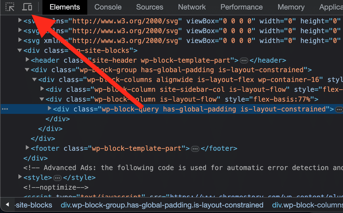
- The page now appears in a narrow phone-shaped frame. Click the same icon again to return to the desktop layout.
- Open the Dimensions menu above the page and pick a phone or tablet to see how the site looks on that screen.

- Leave the menu on Responsive and type your own width and height in the boxes next to it to test any size you like.
Press F12 again, or click the close button in the Developer Tools panel, when you are finished.
Is There a Way to Do This Without Developer Tools?
Yes, if you would rather not open Developer Tools at all. mobiReady is a free online tester. Open a new tab, go to ready.mobi, enter the website address and click Go. It renders the page at phone width and reports how mobile friendly it is.
This route is handy for a quick look at someone else’s site. For anything you need to click through or scroll properly, Developer Tools is the better tool, because you are still in a real Chrome tab.
Why Does the Page Still Look Like the Desktop Site?
If the layout does not change after you switch on the device toolbar, one of these is usually the reason.
- The page has not reloaded. Some sites decide the layout when the page first loads. Press Ctrl + R (or Command + R) while the device toolbar is on.
- The frame is still wide. Check the width in the Dimensions boxes. If Developer Tools is docked at the bottom, the page frame can stay near desktop width. Drag the panel to the side, or pick a named phone from the Dimensions menu.
- The site really has one layout. Plenty of sites use a single responsive design that simply reflows. A narrower column is the mobile version.
- The site checks the device, not the width. A few sites look at the browser’s user agent string instead of the window size. Picking a named device from the Dimensions menu sends a matching phone user agent, which usually gets you the mobile layout.
Frequently Asked Questions
Does this change the website for anyone else?
No. The device toolbar only affects the drawing of the page inside your own tab. Nobody else sees any difference, and the site itself is untouched.
Is there a keyboard shortcut for the device toolbar?
Yes. With Developer Tools open, press Ctrl + Shift + M on Windows, Linux or ChromeOS, or Command + Shift + M on a Mac, to switch the device toolbar on and off.
Can I do this on Chrome for Android or iPhone?
No. Developer Tools is only in desktop Chrome. On a phone you are already getting the mobile version, and Chrome for Android has a Desktop site checkbox in its menu if you want the wide layout instead.
Will the mobile view show me exactly what a real phone shows?
It is very close for layout, but not identical. Your desktop still has its own fonts, graphics hardware and touch behaviour. Treat it as an accurate preview of the layout rather than a perfect copy of a real handset.
Related Reading
- How to Make Text Bigger or Smaller in Google Chrome
- The Keyboard Shortcut to Duplicate a Tab in Chrome
- How to Enable and Use Tab Groups in Chrome
- Using PDFs in Google Chrome
Last verified: 18 August 2026.

Leave a Reply